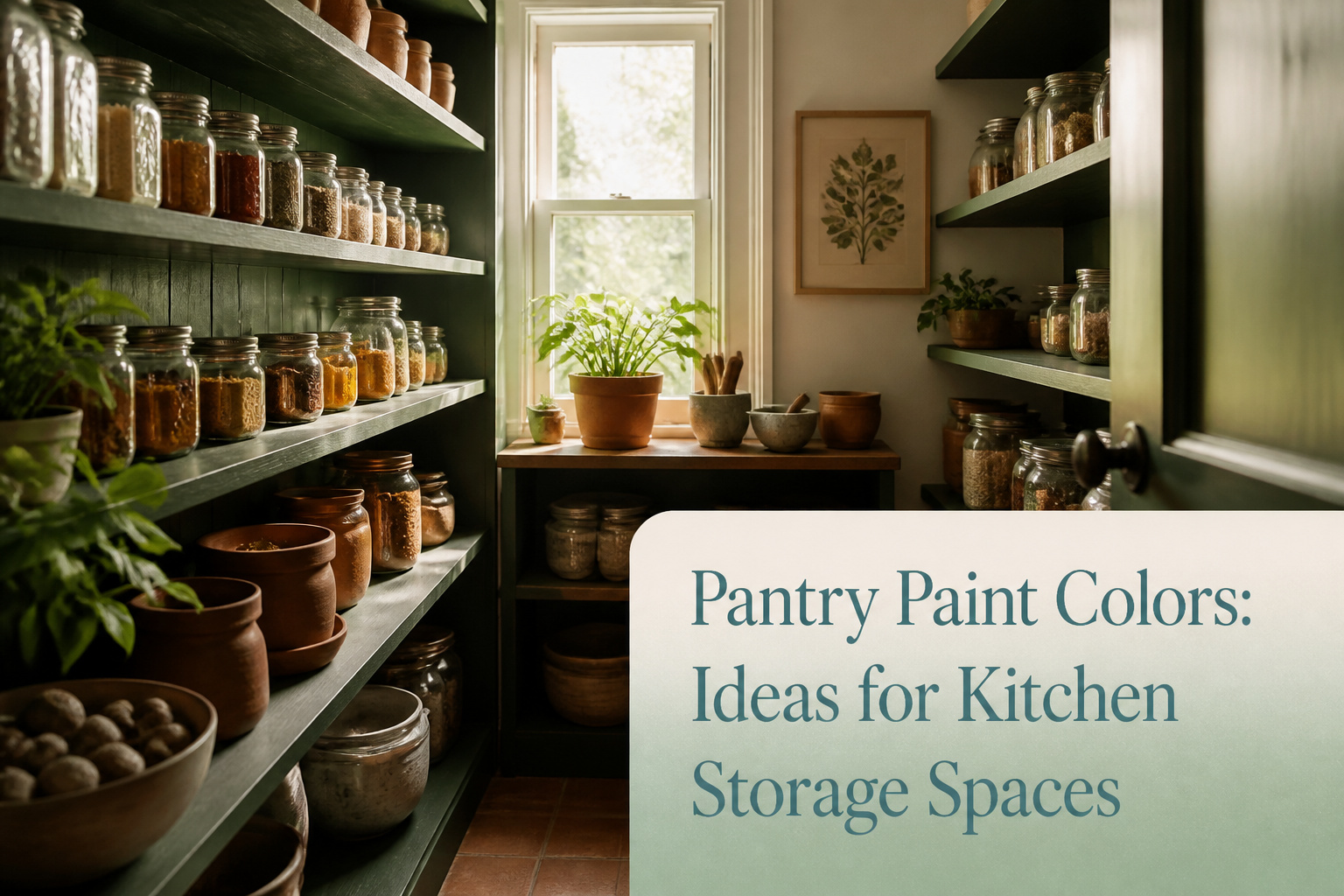
Pantry paint colors are the shades you choose for the walls, shelving, and trim inside kitchen storage spaces, and they matter most when the pantry opens directly into another room. The wrong choice turns every trip for olive oil into a jarring portal, as one writer learned after painting a pantry Off-Black against a warm white kitchen. A light teal like Little Greene’s Aquamarine, taken tonal from walls through ceiling, borrows calm from shallow water without shouting for attention.
1. Light Teal

A pantry painted in Aquamarine or a similar light teal carries the quiet of shallow water into a space that otherwise feels purely functional. The color works because it borrows from nature without shouting about it: a glance toward the shelves registers as calm rather than color-first.
I have seen this tone settle a room best when it covers every surface, walls through ceiling, rather than stopping at the trim. Little Greene’s Aquamarine family is built for this, with shades stepped light enough to keep a small pantry from closing in but related enough to layer without contrast. The effect reads as intentional, not accidental, and the tonal approach saves the decision fatigue of picking one exact right shade.
The trap is pairing it with hardware or storage that fights the mood. Warm brass or unlacquered copper turns the teal clinical; brushed nickel or black iron keeps the temperature even. If your pantry opens directly into a kitchen with strong color, treat the doorway as a threshold rather than a match: let the teal hold its own space instead of sampling the cabinets.
Recommended Products

Ideal for use on interior/exterior surfaces including wood, plastic, plaster, metal, masonry and unglazed ceramic
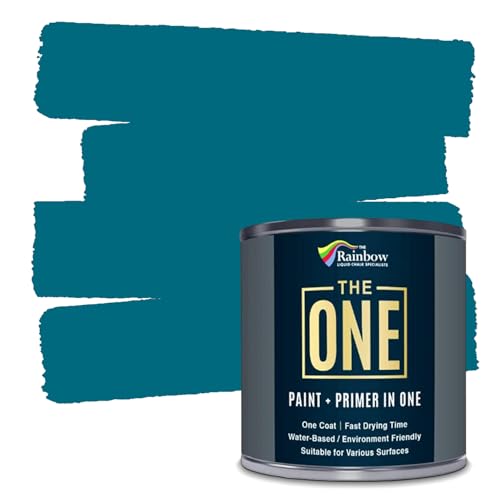
ALL-IN-1 PAINT & PRIMER: A hardy multi-purpose and multi-surface one-coat paint and primer in one for almost any indoor or outdoor surface. A wall, ceiling, floor, skirting board, cabinet, furniture and door paint for your bathroom, kitchen, home and garden.
2. Golden Yellow

A honey-toned yellow like Bombolone brings something most pantry colors don’t. It reads as warmth first, optimism second, and manages both without tipping into kitchen-bright or nursery-cute.
The difference is in the depth. Bombolone sits in that soft gold range where color drenching actually works. Walls, woodwork, shelving, all the same tone. The effect is encompassing rather than loud. I noticed this reading through pantry makeovers where the color held up in tight spaces with single bulbs or no natural light at all. Yellows with more white in the base tend to go flat and slightly sour under LED strips. Bombolone’s honey keeps its weight.
The risk is pairing it with too much warm metal. Brass hardware on golden yellow can read as trying too hard. Nickel, black iron, or plain wood knobs keep the mood practical. This matters in a pantry, which is still a workspace first.
If your kitchen runs cool, with grays or stark whites adjacent, Bombolone becomes a deliberate pocket of warmth rather than a clash. The transition works best with a door frame painted the same yellow, so the pantry reads as its own room rather than a color mistake glimpsed from the hall.
Recommended Products
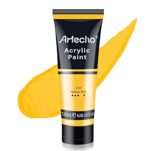
Single Acrylic Pigment: Artecho acrylic paint 4.05oz/120ml tube-Yellow Mid. Individual package is convenient for you to carry around. So You can choose any single pigment as you wish

Weather and corrosion resistant coating protects exterior/interior surfaces like wood, metal, concrete, masonry and more

A modern mixture replacing the pigment originally produced in the early 1800's by collecting urine from oxen fed only mango leaves. Our version is more permanent, more lightfast, totally humane and (best of all) urine-free
3. Green and Brown

A green and brown pairing reads as familiar because it borrows straight from the natural world, and that is exactly why it works in a pantry where you want calm rather than spectacle. The combination of Garden, a bright summery green, with Scullery, a deep brown, gives the space a rustic feel that sits comfortably against bare wood shelving or a traditional stone floor.
I have seen this approach land best in pantries that already lean toward natural finishes. The earthy tones do not compete with the materials; they let the grain and texture take the lead. In one pantry I studied, the owner had left the original floor stone uncovered and used unfinished pine for the shelving. The green and brown walls framed it without shouting.
The risk is making the space feel too dim. Scullery is a deep tone, and in a pantry with limited light it can swallow the room. If your pantry has a single fixture and no window, keep Scullery to the lower half of the wall or the back of a recessed shelf, and let Garden carry the upper surfaces. That division also happens to protect the darker color from the scuffs and moisture that collect near the floor.
Recommended Products

Includes 30 featured and newest released color card. Sprayed on color to see our colors in your homes lighting for more accurate color choices.

RGB LED Light: This kitchen pantry cabinet has premium RGB LED strips, offering dual control convenience via the app remote and the physical switch. Boasting over 60,000 vivid colors, adjustable brightness and music sync, it’s designed to fit every mood and moment, turning your pantry into a stylish, entertaining focal point

TRUE ALL-IN-ONE PAINT & PRIMER – Skip the extra steps. Evolve Tru Coat combines paint and primer in one, delivering excellent adhesion and coverage on wood, metal, masonry, and concrete with minimal prep.
4. Pink and Black

Confetti and Lamp Black make a pairing I would not have predicted until I saw it work. The pink reads as playful and inviting on pantry walls, while the warm black on cabinetry and trim gives the whole space real weight. The contrast builds depth without turning the room dark, which matters when the pantry is already a small footprint with no window.
This combination lands firmly in modern or industrial territory. The sweetness of Confetti keeps Lamp Black from feeling severe, and the black keeps the pink from reading as nursery. In a rental where you cannot change the floor or the overhead fixture, painting the trim in Lamp Black is a fast way to signal intentional design rather than leftover color.
Recommended Products

CABINET TRANSFORMATION: Refresh outdated cabinets, vanities, furniture and trim with rich Pure White color and a smooth semi-gloss finish
5. Classic Green

Green paint in a pantry walks a narrow line between fresh and gimmicky, and Hopper and Garden are the two shades that stay on the right side of it. Both read as classic rather than trendy because their neutral undertones keep them grounded, more sage than circus.
I have watched renters hesitate at the paint chip, worried a bold green will feel like a costume in a small closet. The trick is to treat the color as architecture, not accessory. Painting the cabinetry and woodwork in Hopper or Garden lets the walls breathe, especially if you pair either with a pattern like Spring Flowers wallpaper in the Garden colorway. The wallpaper borrows its green straight from the paint, so the room feels layered rather than busy.
For a tighter budget or a weekend timeline, skip the paper and paint everything, trim included, in one solid coat of Garden. The result still carries that energizing lift, but the single color keeps the space from shrinking. Either way, the shade earns its keep: it looks intentional in morning light and still holds up when you are digging for a can of beans after dark.
6. Red Brown

A red brown like Muscovado turns a pantry into a deliberate design moment rather than afterthought storage. The depth of the color reads as warmth up close without the aggression of a true red, which interior designers often warn against in compact spaces. In my own browsing, the installations that worked kept the surrounding walls quiet, letting the red brown function as a single focal plane against something like Slaked Lime or another soft neutral. The mistake I have seen is treating this shade as an accent color on trim or a single cabinet; at that scale it can look like a mismatch rather than a choice. Where it succeeds, the color covers the full pantry interior or at least a complete wall, so the eye reads it as intentional architecture. For renters, this is a weekend project with real payoff, though you will want to test how the hue behaves under your existing kitchen lighting before committing to the full coat.
7. Warm Neutral

Bath Stone carries a warmth that reads as color without shouting for attention. The shade comes out of the Victorian period, originally used on house exteriors, and that history shows in how it settles next to wood finishes, ceramicware, or a trailing pothos on a shelf. In my own pantry, it turned the back wall into something that felt intentional rather than leftover. The practical side matters too: a warm neutral hides the scuff from sliding bins and the shadow line where shelving meets drywall. Angela Hamwey of Mackenzie & Co. puts the broader case cleanly:
Keeping the paint color consistent with the kitchen creates a seamless flow. Soft, neutral paint colors complement the architecture of the home and work to create a welcoming and inviting atmosphere.
For a pantry that opens directly off the kitchen, that consistency saves you from the jolt of walking into a different world for a can of tomatoes. Pair it with a gentle warm white like Flint on adjoining walls and the space holds together without going flat.
8. Chocolate Brown

A deep chocolate brown like Purple Brown wraps a pantry in something close to a cocoon. The color carries real weight on walls and woodwork both, and that all-encompassed feel can turn a cramped storage closet into a space you actually want to step inside. The pigment is based on burnt sienna, which keeps it from reading as flat black in low light.
The catch is the need for contrast. Without it, the room goes cave instead of cozy. One path is pairing it with a brighter green on an adjacent wall or inside the door frame; the combination reads familiar, almost like garden soil and leaf, and it keeps the brown from swallowing the whole space. Natural wood shelves against Purple Brown work better than painted ones, since the variation in grain breaks up the darkness.
This is not the shade for a pantry that relies on a single overhead bulb. It needs layered light to show its depth, or you lose the reassurance the color is meant to give and end up with something closer to a void. For renters with permission to paint and a weekend to do it, the payoff is a pantry that feels intentional rather than leftover, but the prep matters more here than with paler colors. Two coats minimum, and cut in carefully around shelving brackets where the dark tone will show every waver.
9. Botanical Wallpaper

Small, functional rooms are where a playful choice pays off most. Rodney Street – Sage & Onions, a tree print from the Storybook Papers collection, turns a pantry wall into something that actually makes you smile when you grab the cereal. The sage and onion tones keep it from feeling childish; paired with a deep brown like Elysian Ground on any cabinets or shelving, the whole thing grounds into a real kitchen scheme rather than a novelty.
Wallpaper in a pantry does work paint alone rarely manages. Paint is the safer default, and I have leaned on it plenty, but the narrow walls and single door of most pantries mean you are not committing to a huge surface area. A print this lively would exhaust you across a living room. In a closet-sized food space, it reads as intentional and contained. The practical note: pantry air is humid and shifts temperature, so a good vinyl or wipeable paper matters more than in a bedroom. I have seen standard paper peel at the edges behind a shelf of canned goods; the upgrade is worth it for a space you open twice a day.
Color Psychology

Color in a pantry does more than cover the wall; it sets the emotional temperature of a space you open multiple times a day. Light teals like Aquamarine pull from nature’s quieter moments, the kind of shade that slows your breathing when you’re grabbing flour at 6 a.m. Paint the walls, ceiling, and trim in two or three tonal variations of the same family, and the room wraps around you rather than boxing you in.
Yellow works the opposite way, pushing energy into a room that might otherwise feel like a closet. A soft yellow on pantry cabinets catches morning light and reads as optimism, not cheerleading, which matters in a space dedicated to repetitive tasks.
Neutrals have their own psychology. Soft, warm tones that flow straight from the kitchen create continuity; the pantry stops feeling like a separate utility room and starts reading as an extension of the same welcome. That cohesion matters more than most people realize until they live with the alternative.
Colors to Avoid

Some pantry paint colors fight the space more than they help it. Dark blue can shrink a pantry visually, making it feel confined and congested rather than organized and open. If you are drawn to darker shades, limiting them to a feature wall or a small section keeps the room from closing in on you.
Bright red and bright white carry their own problems. Red is too aggressive for a space where you are scanning shelves and reaching for ingredients; it distracts rather than settles. Pure white, meanwhile, can turn harsh under the single overhead bulb most pantries rely on, bouncing glare back at you while every scuff and spill announces itself the same day.
I learned the white lesson the hard way in our last rental. The landlord had freshly painted the pantry a glossy bright white before we moved in, and within a month the door frame was marked with fingerprints I could not scrub off without leaving a larger smudge. We lived with it for two years, but I never stopped noticing it. Now I steer friends toward softer off-whites or muted tones that forgive real use.
Kitchen Cohesion

The pantry door swings open dozens of times a day, and each swing is a chance for the color inside to either whisper or shout against what sits beyond the frame. Keeping the paint consistent with the kitchen creates a flow that makes both spaces feel larger, a trick I learned after painting one pantry Farrow & Ball’s Off-Black while the adjacent kitchen stayed warm white. The contrast looked intentional in photos, but living with it meant every trip for olive oil felt like stepping through a portal.
Soft neutrals bridge the gap without demanding attention. Off-whites especially read as classic pantry colors that stay current year after year, and they carry enough warmth to avoid the clinical edge that bright white can bring to a small closed space. After the black pantry experiment, I repainted in Benjamin Moore’s White Dove at half strength, matching the kitchen trim rather than the wall color exactly. The result was quieter, more forgiving when the door stood open, and the space still felt light.
The choice between matching walls or matching trim depends on how often your pantry door stays ajar. Mine rarely closes fully, so trim alignment won.
Frequently Asked Questions
What are the best colors for a pantry?
Soft neutrals like Bath Stone, light teals such as Aquamarine, and warm yellows like Bombolone all work well in pantries. The best choice depends on your kitchen’s existing palette and how much natural light the space gets. A warm neutral keeps the flow seamless if the pantry opens directly into the kitchen, while a bolder color like golden yellow or classic green turns the pantry into its own intentional room.
What colors should I avoid in a pantry?
Skip dark blue, bright red, and pure bright white. Dark blue visually shrinks the space and makes it feel congested. Bright red is too aggressive for a room where you scan shelves and reach for ingredients. Pure white turns harsh under single overhead bulbs, bounces glare, and shows every scuff and fingerprint the same day.
How can I make my pantry look better?
Keep the paint color consistent with your kitchen to create a seamless flow rather than a jarring transition. Soft, neutral paint colors that complement your home’s architecture create a welcoming atmosphere. If your pantry door tends to stay open, matching the trim color to the kitchen trim works better than matching wall colors exactly.